Illuminating Engineering Society, Toronto IES Illumination Section Award (2023)
American Institute of Architects (AIA) Canada Awards, Interior Architecture Award of Excellence (2022)
Canadian Interior Awards, Office Award Winner (2022)
Interior Designers of Canada (IDC) Value of Design Awards, Award of Excellence (2022)
A Canadian art collection in a functional workplace.
Located in downtown Toronto, this 25,000 square-foot tenant fit-up occupies one level of a WELL Core v1 Silver certified office tower. To realize the vision of the client, an avid art collector, thoughtful luminaire selection was required for the workspace. This space is filled with precisely placed lighting and the engineering solutions throughout work to support this award-winning lighting design.
Smith + Andersen provided mechanical engineering, electrical engineering, lighting, audio-visual, and communications design services.
A cohesive contrast.
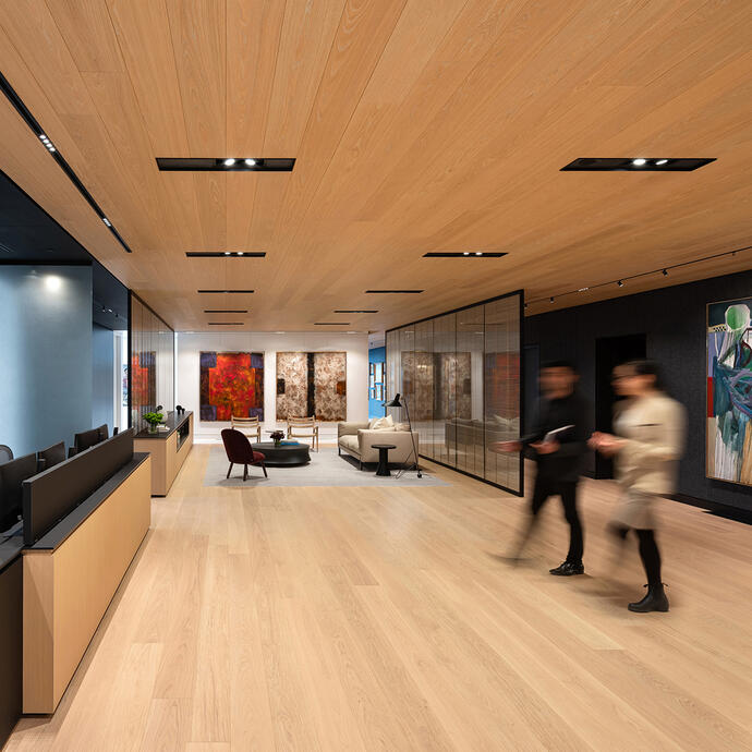
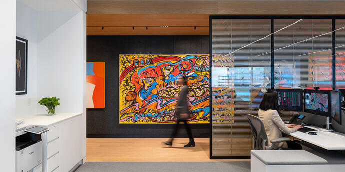
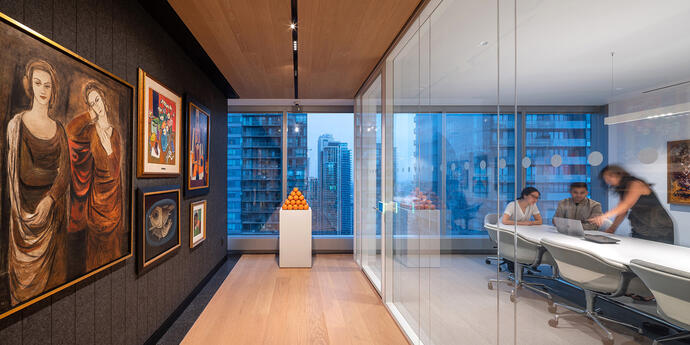
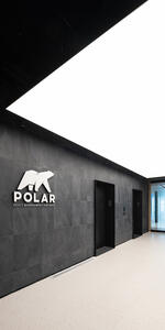
From the start the lighting design, a distinct entrance makes it clear this is not just an office. A single, custom-made glowing panel in the entrance marks the space as a private refuge from the outside world. This soft illumination at the building’s core provides a striking contrast to an adjacent gallery room, where artwork, supplemented by concentrated lighting, “pops” from black walls. Deliberately abrupt delineation between work and art is maintained throughout the office.
To highlight the displayed artworks with the reverence that they deserve, miniature projectors are mounted on a recessed track system running the full length of the exhibition area. This arrangement is also flexible, and projectors can be moved and adjusted to appropriately highlight each piece of art.
A shifted focus.
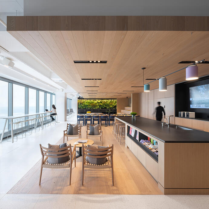
Collaborative areas (that showcase people rather than art), required a different approach to illumination. A combination of fixtures, with lenses and baffles for glare control, provide visual comfort for work spaces. Multiple downlights increase illumination in the reception and social areas, and decorative lighting elements, such as pendants, add pops of colour and visual interest.
It’s all about balance.
While the focus of our design efforts prioritized the lighting design, our engineering teams work together to design solutions that prioritized our client’s goals. In line with these objectives, the result of these efforts is a functional workplace that showcases an impressive Canadian art collection. The space’s design combines dramatic yet practical displays that achieve just the right balance of a modern office and a private art gallery.
